 » Marketing and Communication » Web Services » Using Cascade & How To's » How-to Guides
The web team has developed several templates to consistently apply our styles and provide a clean user experience across devices. Here you'll find recommendations and guides to using some of our specialty templates. Be sure check out our examples page to see the templates in action.
*Note: this is not a complete list of all possible uses, just some ideas to get started. The Web Team also regularly adds new options.
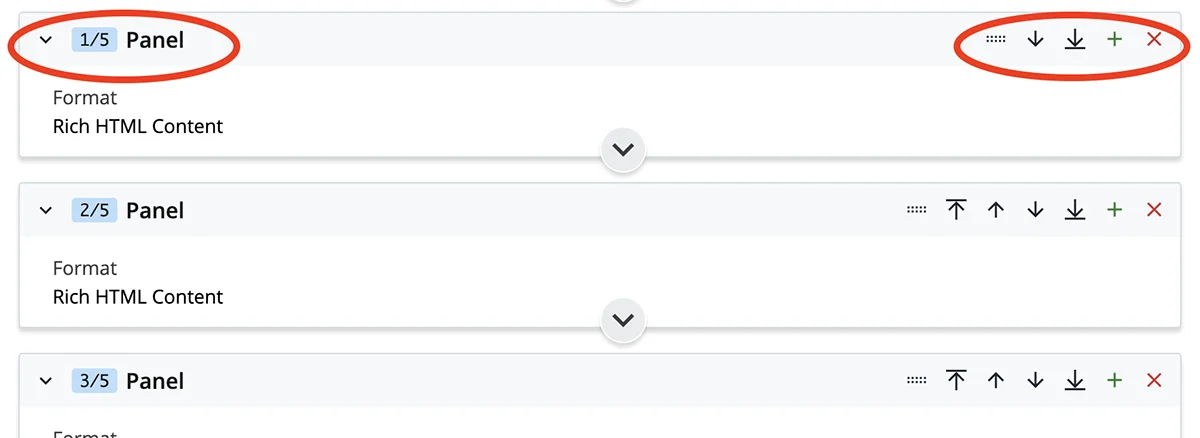
*Tip: Collapse and rearrange groups in the page editor interface for a section such as panel, accordion, etc. Collapse section headings you aren't working in to simplify the interface. On the flip side, it is good to note that content needing edited can sometimes hide in these collapsed sections.
Also, rearrange the order of group items by selecting the up/down arrows or use the drag/drop feature.
*Tip: Use the previews along the way to test your edits, there are two methods:
- Edit Before Previewing (Default Editing Experience - after making edits to a page, select "Preview Draft." Click edit to reenter the editor screen, or submit if satisfied with the changes.)
- Edit While Previewing (Select "Show Edit Preview" in the page editor to show a side-by-side preview that updates in real time.)
There are several different formats you can use to display your content properly. To change or adjust the format of your content, navigate to the designated panel and select the format best suited for your content. Some options include (keep in mind we add new options regularly): 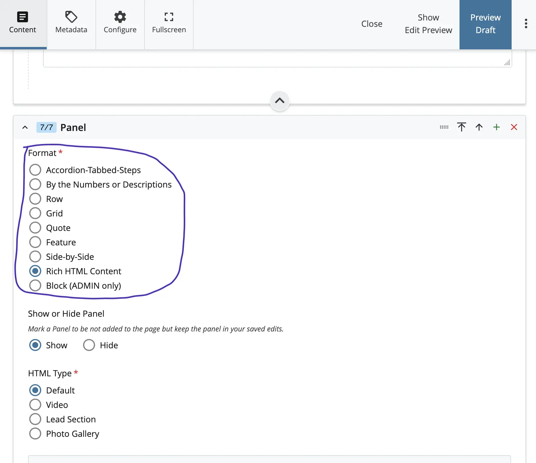

Implementing important links can be good way to add quick navigation on your webpage. To utilize the important links select “Yes” after “Include Important Links?.” Then in the Important Links group you can enter/edit the link(s) text and location.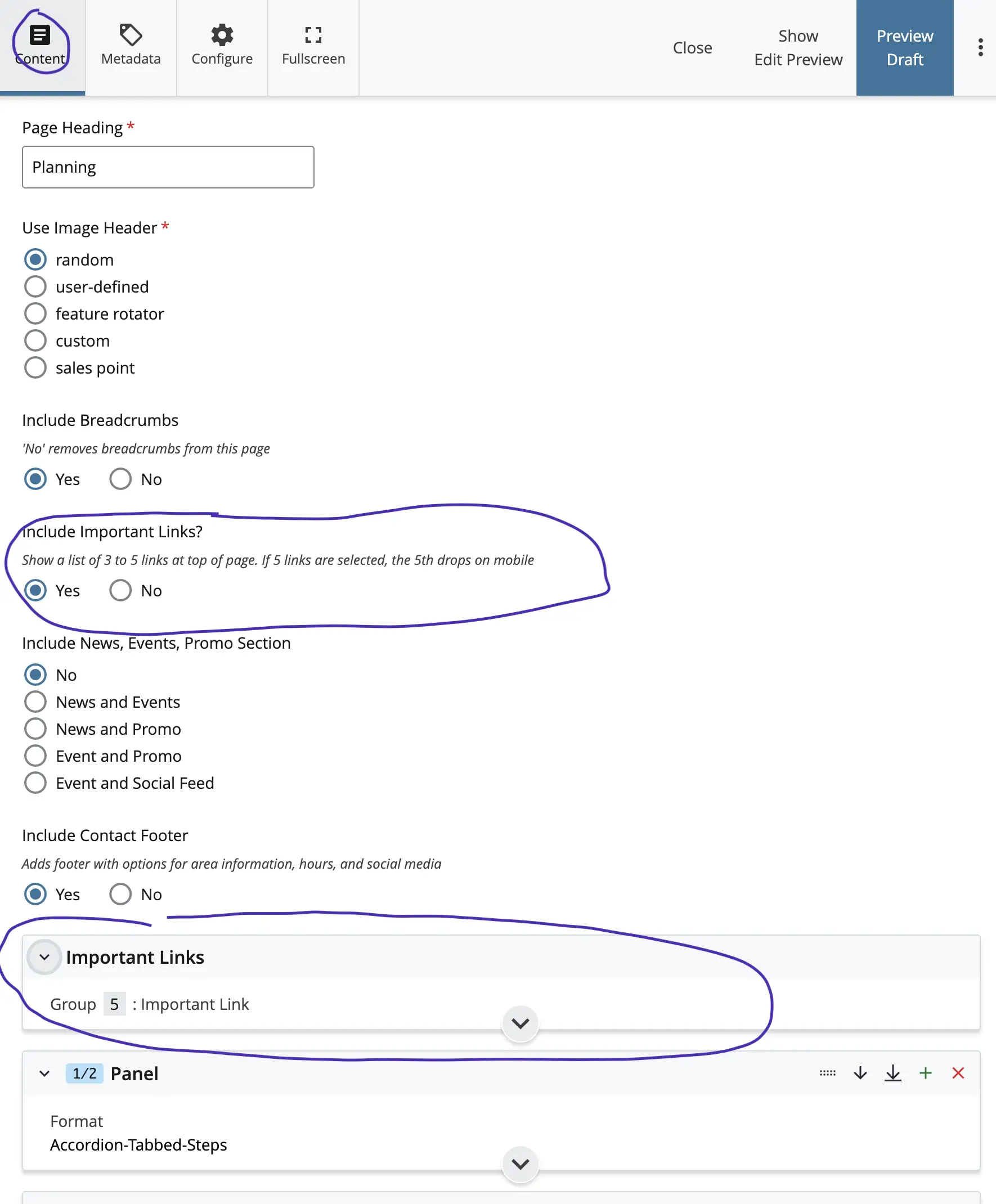
This panel type is great for welcome statements, intros, etc. It is also designed to accommodate videos or photo galleries. To utilize: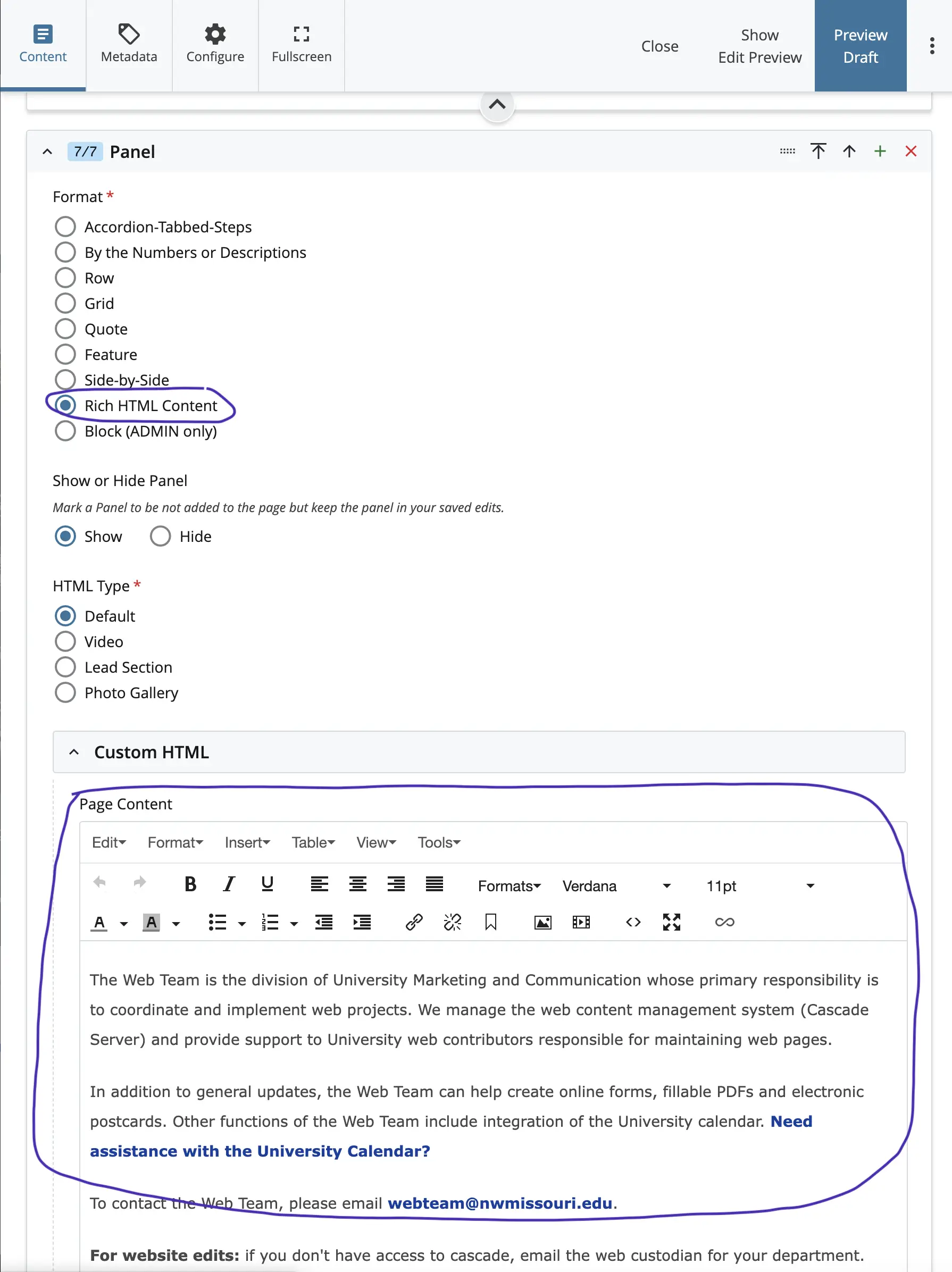
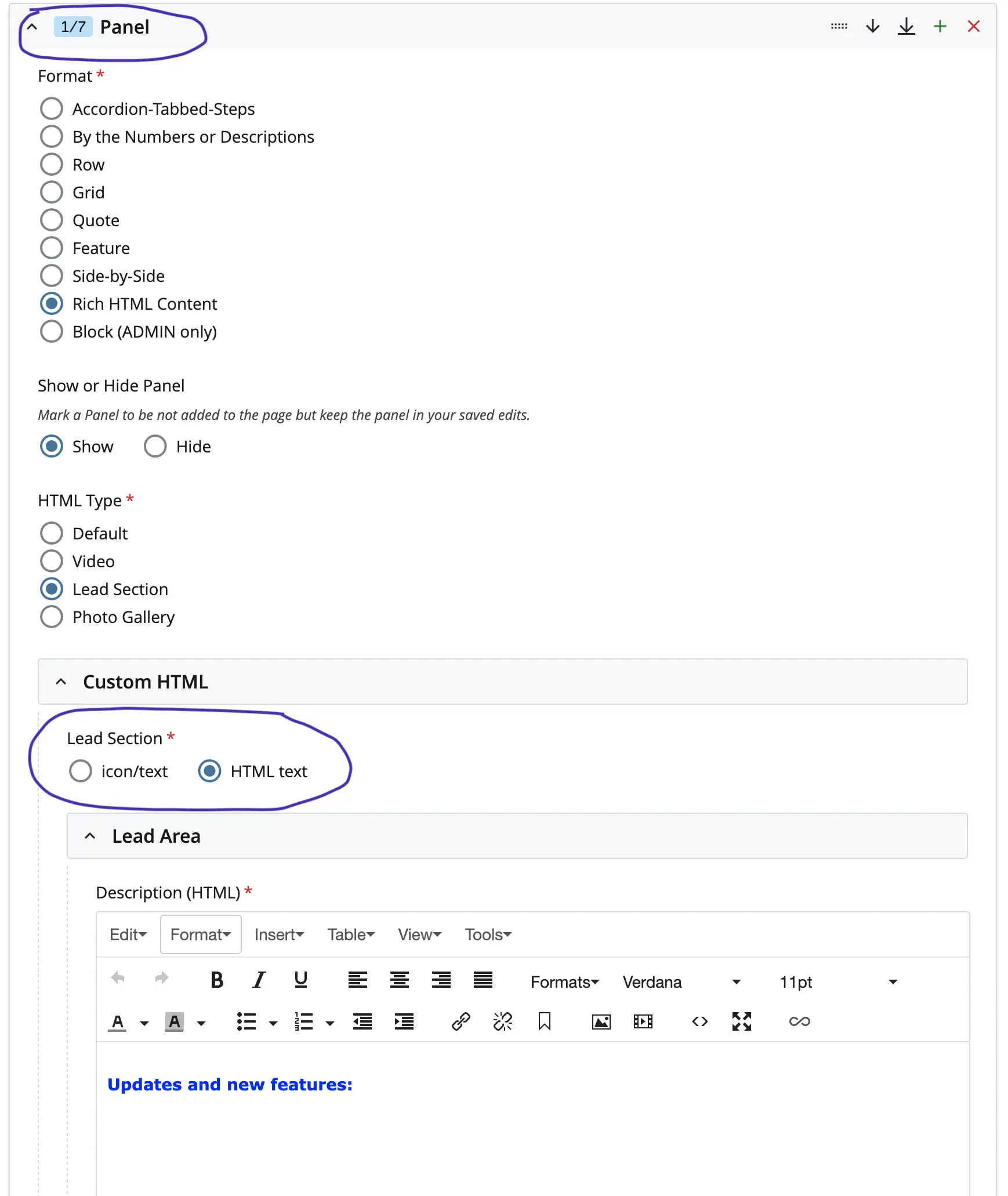
A lead section is an area of highlighted/priority content that adds a blue background separating it from the rest of the page's content. There are two options you can choose from:
This is used for displaying contact information, hours and social media. You can show any combination of the three (Contact/Hours/Social). To utilize the Footer option select “Yes” for “Include Contact Footer.” This section is up top in the site-home panels area. After you select which “yes” you can scroll to the bottom of the page to see the added section.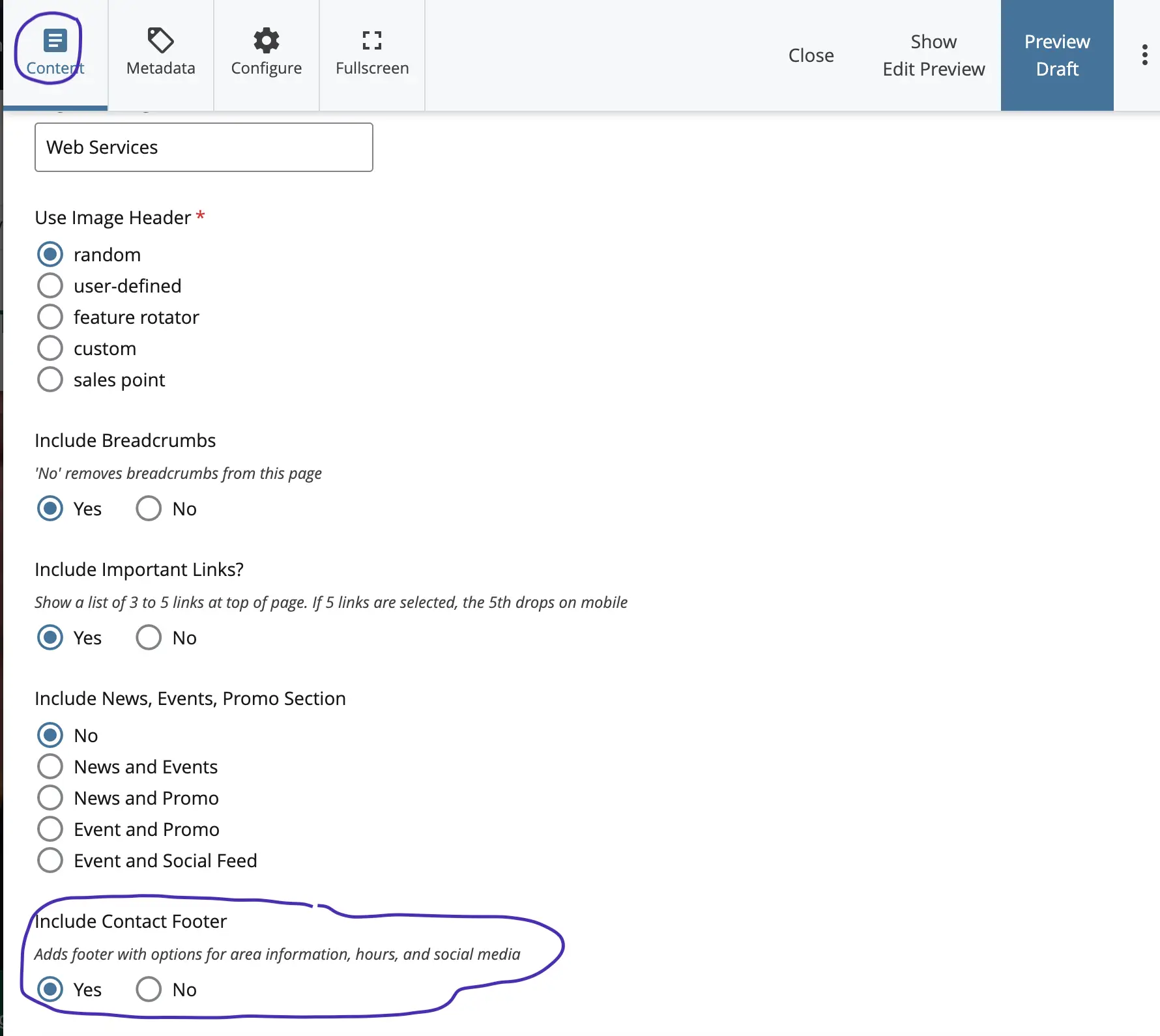
*Tip: The templates are responsive (i.e., mobile-friendly) so the presentation of a website will change depending on factors such as display size and device type. Varying lengths of text or image proportions may not work well in certain scenarios.
Be sure to manually resize your browser to see how your a webpage looks on different display sizes.
After you have finished editing you will submit.


